Responsive Website Redesign
Department of Education
The Problem
The website was very outdated and some important information was hard to find because the site was a long series of inconsistent links.
The Solution
50%
Faster Information Access
3x
Improved User Interaction
My Role


UX Researcher
Mobile UI Designer
Research Plan
A structured approach to identify user challenges and guide design improvements.
To begin this project, we needed to collect data from which to define the problems the users are having with the site in order to propose changes. We set out the following plan to achieve this:
Step 1
Audit existing site for accessibility and design issues
Step 2
Develop proto personas to form initial assumptions
Step 3
Conduct user testing to observe navigation and pain points
Step 4
Synthesize testing data into actionable design items
Step 5
Prioritize features using an impact matrix
Step 6
Create data-driven user personas from testing results
UX Audit
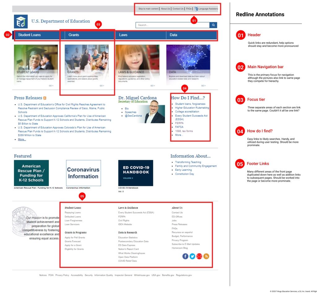
We started our process by looking closely at the current state of the website. We looked at basic site functionality and usability. We found the accessibility of its colors to be non-compliant. We reviewed web design best practices to see how they could be better utilized on this site and saw that the site’s linking system was inconsistent. Finally, we also checked the hierarchy to see what was the site telling us and couldn’t determine where the site wanted us to look. This is an issue because it makes the user confused and has to search for where to go.
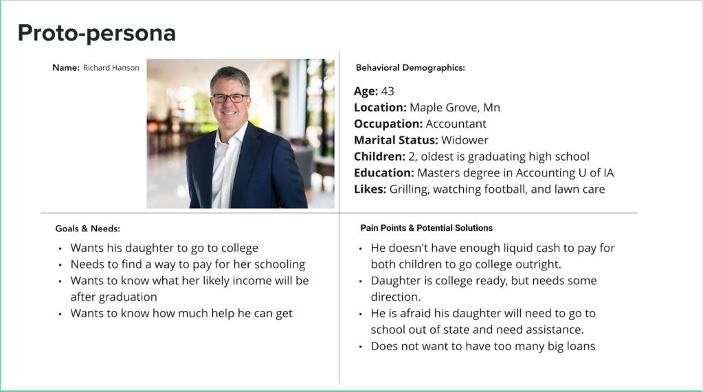
We began our process by working on assumptions. With these assumptions, we created our proto-persona, Richard, to better dial in who our target user was.
User testing plan
1. Find information on Pell grants.
2. Navigate to where the 1098-E tax form information is found.
3. Locate the information page about the Every Student Succeeds Act (ESSA).
4. Find the general contact number from the Department of Education
User Testing
Usability Findings
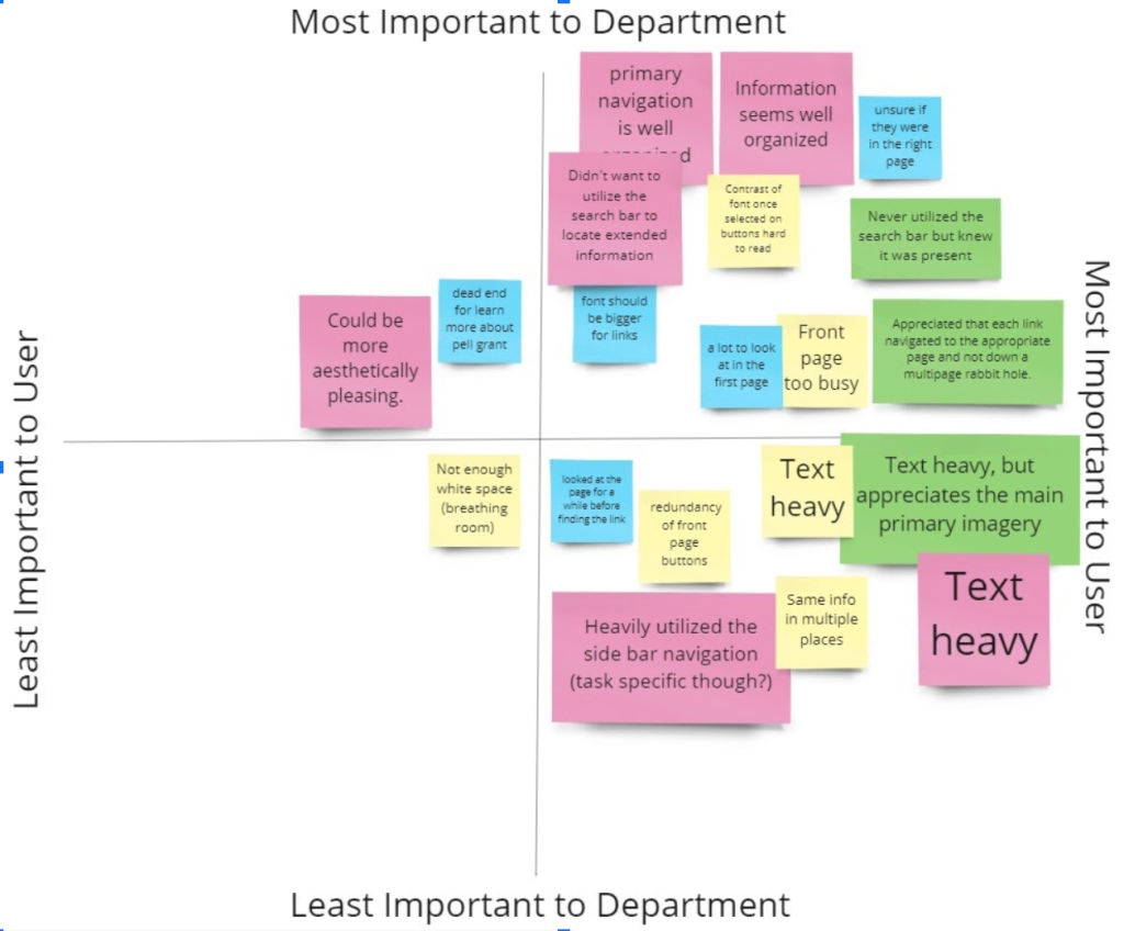
Synthesizing the insights came next. We took what we learned from the testing and assembled them into a matrix to decide what would have the most impact on helping Richard meet his needs.
This is the text area for this paragraph. Once you've added your content, you can fully customize its design using the tools available — adjust colors, fonts, font sizes, alignment, and more.
User Persona Overview
Identifying all parts of navigation on the main page was a crucial step. The goal was to ensure the navigation remains simple and intuitive for every user.
This is the text area for this paragraph. Once you've added your content, you can fully customize its design using the tools available — adjust colors, fonts, font sizes, alignment, and more.

Card Sorting
[Placeholder]
Our team utilized the Optimal Sort feature from Optimalworkshop.com to find new ways of grouping the different web pages within the site. We used this information to aid in restructuring the sight map. One of the main takeaways from this activity was that almost every tester chose to place a majority of the errant links on the main page into the resources category. This allowed up to greatly improve the layout and hierarchy without sacrificing usability.
Site Map
Refining Navigation with User Insights

Task Flow
Focused Steps
We proceeded to further understand Jennifer by hypothesizing what her path on the website would be. Since we found through user testing that the user flow was functional, we decided the site’s UI was all that needed updating.
[Placeholder]
Existing User Flow
We created a style tile to unify colors, typography, and UI elements for consistent design. Proxima Nova was selected for its clarity, and the original blue was darkened to convey trust and stability.
This is the text area for this paragraph. Once you've added your content, you can fully customize its design using the tools available — adjust colors, fonts, font sizes, alignment, and more.